


LOGO DESIGN
The primary need was to have a typographical logo, a signature to be used in online and offline communication. I therefore chose to design a minimalist logo through the use of elegant and modern typography.
The primary need was to have a typographical logo, a signature to be used in online and offline communication. I therefore chose to design a minimalist logo through the use of elegant and modern typography.
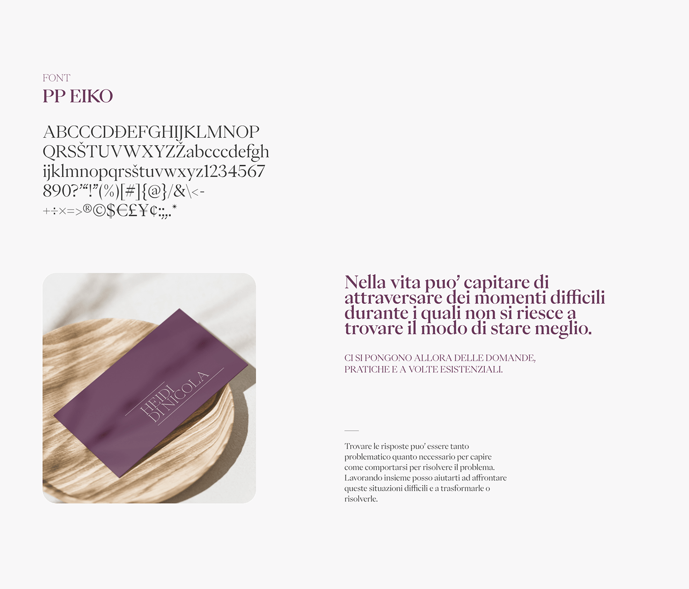
The choice fell on the PP Eiko font, a graceful but modern font.
The naming on two lines to give weight to the customer’s name and surname. Naming enclosed and contained within two lines that go from the outside towards the inside, which enclose in naming and which represent the protection and help that Heidi gives to her patients, a welcoming logo in which the chromatic choice helps to give a sense of security and professionalism.
A linear, minimal but elegant logo.
information architecture
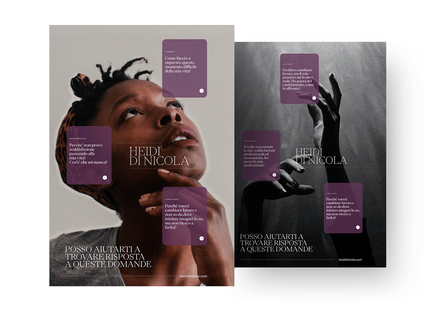
We have identified the most common problems for which a person could seek the service of a psychologist, we have therefore classified them into relevant categories, easy to understand for the site’s target audience.
Each category has its own landing page, so as to leave the psychologist free over time to be able to “scale” and implement any new problems she wants to address and on the other hand help the user with a greater completeness of services with respect to problems that very often they are transversal and difficult to classify.
Every single “problem” was then addressed in depth, to make the end user understand Heidi Di Nicola’s way of working, so as to be able to choose her for her approach, for her words.
On each page there is the possibility of direct contact with the professional without having to leave the page.


